When planning family portraits, we should choose neutral colors like cream, gray, and tan for timeless looks. Adding seasonal accents, such as burnt orange in fall, can enhance our outfits. Incorporating soft pastels or white creates a fresh feel, while avoiding bold patterns helps keep our focus on family connections. Earth tones like olive green work well against natural backgrounds, blending beautifully. If we keep exploring our options, we’ll find even more tips for stunning portraits.
Key Takeaways
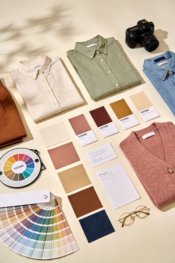
- Choose neutral colors like cream, gray, and tan for timeless, classic family looks that enhance skin tones.
- Incorporate soft blues and earth tones to complement outdoor settings and create inviting vibes in portraits.
- Opt for deep jewel tones for elegance and warmth, suitable across various seasons.
- Select cohesive outfits with textures, prioritizing lighter materials for comfort and polished appearance in photos.
- Avoid clashing colors and bold prints; focus on solid or subtle patterns to maintain attention on family connections.
How to Choose Neutral Colors for Timeless Family Photos
When picking neutral colors for family photos, you might wonder how to make sure those pictures stand the test of time. Choosing timeless neutrals like cream, gray, or tan can really set the mood for a classic look that fits perfectly in a variety of settings. They also allow for some fun seasonal accents; for example, you could add a touch of burnt orange in the fall or soft pastels in the spring. This way, your photos maintain a fresh vibe while still feeling cohesive.
When you’re doing outdoor shoots, lighter shades can create a lovely contrast with all the greenery or woodsy backdrops. It’s all about finding shades that compliment each family member’s skin tone. Think about it: when everyone feels good in what they’re wearing, it shows in the photos.
Here’s the trick: focus on those timeless neutrals and mix in some thoughtful pairings to ensure your family photos look just as great in ten years. For younger children, consider incorporating dressy baby vests as stylish layering options that enhance overall appearance and ensure comfort.
The Art of Incorporating White Into Your Wardrobe for Family Photos

Are you struggling to figure out what to wear for your family photos? Incorporating white into your wardrobe can really make those memories pop, especially against beautiful outdoor backgrounds. Think about classic white dresses or crisp button-up shirts that not only look stylish but also keep everyone comfortable. White has this lovely way of symbolizing purity and unity, which can really elevate the vibe of your portraits.
When pairing white outfits, consider balancing them with neutral colors like soft grays or light tans. This keeps the overall look cohesive and polished. Honestly, you might want to steer clear of bold patterns since they can pull attention away from the moment you’re trying to capture.
In outdoor settings, white truly stands out. Picture it: lush greenery or a sandy beach providing a stunning contrast to your outfits. Plus, white reflects light really well, which helps keep your photos vibrant and prevents any dull images. Additionally, layering can help maintain comfort, much like how adjustable elements in baby clothing allow for ease and flexibility.
So, what are some specific outfit ideas? Here are a few suggestions:
- Classic white dresses for the ladies
- Crisp button-up shirts for the guys
- White shorts or pants for a relaxed vibe
- Incorporate accessories in neutral tones to tie everything together
Truth is, your family photos should be a reflection of joyful moments. As you think about incorporating white, remember that it can create a timeless and beautiful look for your family. What’s your favorite way to incorporate white into your own wardrobe?
Best Shades of Blue for Family Portraits?

Choosing the right colors for family portraits can feel tricky, right? You want those photos to capture the love and connection in your family, but you also want them to look stylish. One of the best options out there? Shades of blue!
Soft blues are absolutely lovely for spring and summer photos. They pair well with pastels and gentle greens, creating a serene vibe. If you’re planning a fall portrait, consider going with a deeper navy—it’s a classic choice that works beautifully with burgundy and tan. Just remember, too bright a blue can sometimes cast odd tones on skin, so reaching for something like blue-grey might be your best bet.
Here’s the trick: Instead of dressing everyone in identical outfits, try mixing different shades of blue. This approach not only adds visual interest but also keeps the focus on what really matters—your family’s love and connection. You want your portraits to feel cohesive, not cookie-cutter.
So, why does this matter? Because the right colors can truly elevate your family photos and make those memories even more special. Truth is, choosing shades that complement everyone instead of matching completely can lead to stunning visuals.
Wrap up your planning with a little thought about the season and your family’s unique style. What shades resonate with you? Happy shooting!
Also, consider the comfort for baby when selecting outfits for family portraits that include little ones, as soft, breathable fabrics ensure everyone looks and feels their best.
Practical Tips for Embracing Earth Tones in Family Photos
Are you looking for a way to make your family photos feel more connected to nature? Embracing earth tones might just be the answer you’re looking for. These hues can really enhance the natural beauty around you while creating that warm, inviting vibe we all love. Think about colors like sage green, muted brown, and soft mustard. They don’t just look good on their own; they also blend beautifully with outdoor settings, whether you’re in a woodsy area or a field of rolling hills.
Here’s a simple trick: try pairing olive green with tan. It keeps everything harmonious without making anyone blend into the background. Rich browns can also help your family pop against vibrant greenery, which is perfect for capturing those picturesque moments. The best part is that mixing in different textures can give you that extra touch. A cozy knitted sweater or a classic denim jacket can take your photos from good to great.
When choosing outfits, comfort is key. If everyone feels good in what they’re wearing, it shows! You want those smiles and genuine connections to shine through. So, why does this matter? Well, memorable portraits are all about showcasing your family’s warmth and that special connection to nature. For cooler outdoor shoots, layering with fleece jackets can provide warmth without bulk, ensuring comfort while complementing the earth tone palette.
Why Jewel Tones Work Well for Family Photos in Any Season
Have you ever struggled to choose outfits for family photos? It can be a real challenge to find colors that look good on everyone and still pop against your backdrop. That’s where jewel tones come in.
These deep, rich colors—think dark greens, blues, and burgundies—work wonders for family portraits, no matter what season it is. They bring a striking elegance to your photos that helps everyone stand out. For example, a navy dress with mustard accents can create a beautiful autumn vibe. Plus, jewel tones are incredibly versatile; they can seamlessly blend into winter gatherings or springtime blooms.
Why go this route? Jewel tones add warmth and depth to your images, making them feel inviting and rich. They also flatter various skin tones, avoiding the sometimes harsh effects of brighter colors.
Here’s a tip: when planning your family outfits, think about how these colors complement each other. You could mix and match shades like emerald green with golds or rich purples with warm neutrals. The best part is that these combinations maintain a timeless quality, which means your family photos will stay stunning for years to come.
In a nutshell, choosing jewel tones for your family portraits can elevate the whole experience. Additionally, incorporating high-quality fabrics like cotton or linen can enhance comfort and appearance in your photos. So, what’s stopping you from trying these beautiful colors for your next family photo session?
Coordinating Family Outfits for Cohesion
When it comes to family portraits, figuring out what everyone should wear can feel like a real challenge. You want everyone to look good, but the goal is to create a cohesive look that pulls the whole photo together. So, how do you do that? It starts with choosing a color palette that works for everyone while also considering different textures.
If you fancy soft blues for the family, think about pairing those shades with lighter fabrics like linen or cotton. These materials not only photograph beautifully, but they also add a nice depth to the outfit. You can even throw in some neutrals, like cream or taupe, to help balance things out. This can create an inviting look that feels serene.
Now, if you lean toward earth tones, mixing rich browns with muted yellows can give off a warm vibe. The key here is to ensure that everyone feels comfortable and confident in what they’re wearing. Remember, when everyone has a say in the outfits, it makes for a more genuine feel in your photos.
Here’s a tip: consider the location of your shoot. If it’s outdoors in a park, that can influence your color choices, so think about the surroundings. Choosing colors that stand out against the background can really make your family pop in the pictures.
Honestly, by being intentional with your colors and textures, your family portraits will have that polished look you’re aiming for. It’s all about capturing those special moments with an effortless vibe. So, what colors are you thinking for your next family photo? Incorporating neutral colors like gray can also add timeless versatility to your family’s wardrobe, ensuring the outfits complement various backgrounds and occasions.
Common Color Pitfalls in Family Photography to Avoid
Planning a family photo session can be exciting, but if you’re not careful, you might run into some common color pitfalls that could hurt your images. Ever noticed how clashing colors can pull focus away from your smiling faces? It can be overwhelming to look at all those bright hues. Instead, think about using complementary shades to create a more balanced and harmonious look.
Distracting patterns can also be a big no-no. Bold prints might seem fun, but they can steal attention from what really matters—your family connections. You want the focus to be on your loved ones, not on what everyone is wearing. So, when it comes to clothing, solid colors or subtle prints are often the way to go. This keeps the spotlight where it belongs, on those sweet moments you’re capturing.
What’s the takeaway here? Stick to a color palette that helps amplify the warmth and connection in your photos. You’ll find that these little changes can make a big difference when it comes to how your family portraits turn out.
Have you thought about how your wardrobe choices can impact your next photo session? Making a few mindful decisions can really elevate your family pictures—trust that eye for detail! Choosing fabrics with soft seams and snug linings can also enhance comfort during the shoot, keeping everyone relaxed and natural in the photos.
Seasonal Adaptation of Colors for Different Locations
As families gear up for photo sessions, you might be wondering how to choose the right colors that fit the season and location. It’s amazing how the right outfits can really jazz up those family photos! For spring and summer, think about going for soft blues, greens, or pastels. These shades not only look great but also blend beautifully with nature.
Now, when it comes to autumn, those rich, earthy tones like burgundy and mustard really shine. They give off that warm and cozy vibe, especially with the backdrop of falling leaves. So, do you want your photos to capture that seasonal charm? Trust me, they’ll look so inviting!
Neutrals like cream or light gray are always good options. They mix well with various settings and keep your family’s style classic. Here’s the trick: by matching your outfits with the environment around you, you strike a perfect balance that highlights your family’s best features without cluttering the scene.
Planning your outfits according to the season ensures that your photos come out not just beautiful, but also truly representative of that moment in time. Think about how excited you’ll feel looking back at those memories! What colors resonate with your family’s style?
Additionally, considering versatility for daily use in clothing choices can help your family feel comfortable and look great not only in photos but throughout the day.
Using Pastels in Spring and Summer Family Portraits
Are you gearing up for family portraits this spring or summer? Choosing the right colors can really make a difference, and that’s where pastels come in. These soft shades can elevate your photos and harmonize beautifully with blooming flowers and vibrant greenery.
Think about using shades like soft blues, dusty pinks, and gentle yellows. These tones blend seamlessly together and look stunning in pictures. Try mixing them with light neutrals such as cream or khaki for a well-rounded look. This color balance not only enhances your family’s features but makes everyone feel great in front of the camera.
Pastel hues don’t just photograph beautifully; they also work with a variety of skin tones, making them versatile for family portraits. When you’re out in a park or garden, those light colors will help your family stand out against the colorful backgrounds around you. Honestly, it’s all about creating a harmonious look that brings out the best in everyone.
So, what are some options you might consider? Here’s a quick list:
- Soft blues
- Dusty pinks
- Gentle yellows
- Light neutrals like cream and khaki
Embracing pastels can lead to stunning family photos that you’ll cherish forever. Why not give it a try this season? Get together with your family, explore these color combinations, and enjoy capturing those precious moments. Additionally, incorporating soft fabrics can enhance comfort and style during your portrait session.
Frequently Asked Questions
What Accessories Should I Consider When Dressing for Family Photos?
When we think of a family photo, we picture a lovely bouquet. Statement jewelry, hats, and scarves add just the right touches, like vibrant blooms enhancing a garden. Let’s make our portraits shine!
How Can I Incorporate Patterns Without Clashing?
We can incorporate patterns by mixing prints carefully, ensuring they share a similar color palette. Layering techniques, like pairing a patterned top with a solid bottom, helps create balance without overwhelming our family portrait.
Should I Choose Individual Styles or Matching Outfits for Family Portraits?
Choosing individual styles paints a beautiful canvas of personal expression, while matching outfits create a cohesive vision. We can blend both approaches, celebrating our uniqueness while maintaining harmony in every snapshot. This balance truly captures our family’s essence.
What Materials Photograph Best in Natural Light?
For natural light, we find that lightweight fabrics like cotton and linen photograph beautifully. Their soft textures enhance imagery, while silk adds elegance. We should consider layering different materials to create visual interest in our photos.
How Do I Ensure Everyone Feels Comfortable in Their Clothing?
To guarantee everyone feels comfortable in their clothing, let’s prioritize family engagement by choosing outfits that reflect our personalities while maintaining color cohesion. That way, we’ll capture authentic moments that represent us beautifully together.


 8")